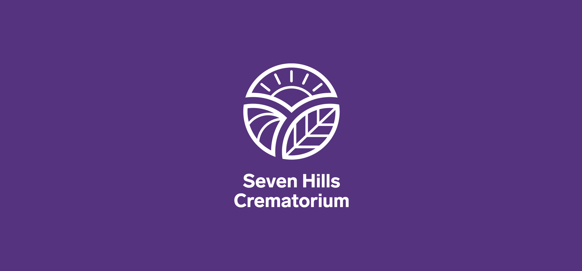
Details: Seven Hills was a newly built crematorium that wanted their identity to reflect the naturally beautiful site it was located on. The logo depicts elements from nature - the sun, a leaf and a field. These were formed around a circluar base, which also gave a feeling of unity; another value they wanted to communicate. The result was an uplifting look and feel which represented the lovely site it was situated on.
Year: 2015
The majority of my logo collection consists of working with start-up businesses to communicate their values while creating and crafting their brand identities.
Brand Identity | Typography
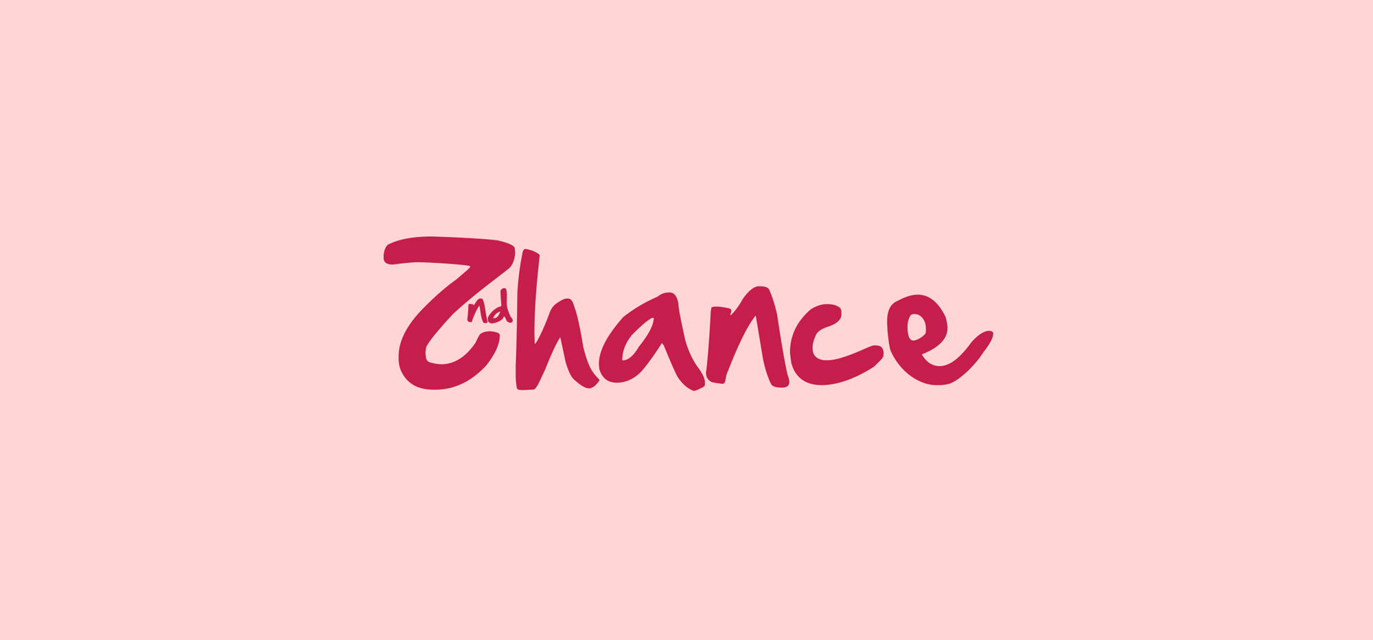
Details: Second Chance is a Leeds-based charity, supporting people living with brain injury. I was part of the team tasked with refreshing their identity, which included creating this wordmark.
Year: 2016
Details: Orwell River Cruises are a leisure business, offering cruises up and down the River Orwell, in Suffolk. I created their monogram to showcase and incorporate three different elements – the top half of the icon is inspired by the Orwell Bridge (the most well known landmark associated with the region) and the bottom half is the reflection indicating the river itself. Finally, these two elements come together to form an ‘o’.
Year: 2019
Details: Sprout is a business consultancy, with the aim of ‘building budding brands’. I therefore wanted the wordmark to bring to life their strapline and vision - the descender of the ‘R’ and ascender of the ‘T’ wrapping around other letters gave a feeling of buds sprouting and growing. The reveal animation captured the energy and vibrancy behind the brand.
Year: 2018
Details: Calgoz is a logistics company, shipping raw materials from Europe to Africa and the Middle East. Due to the abstract brand name, I wanted to design an icon which gave more of a clue towards the transportation element behind the brand. Lines made up the ‘C’, travelling from apex to apex, conveying the journeys that were crucial to this business.
Year: 2017
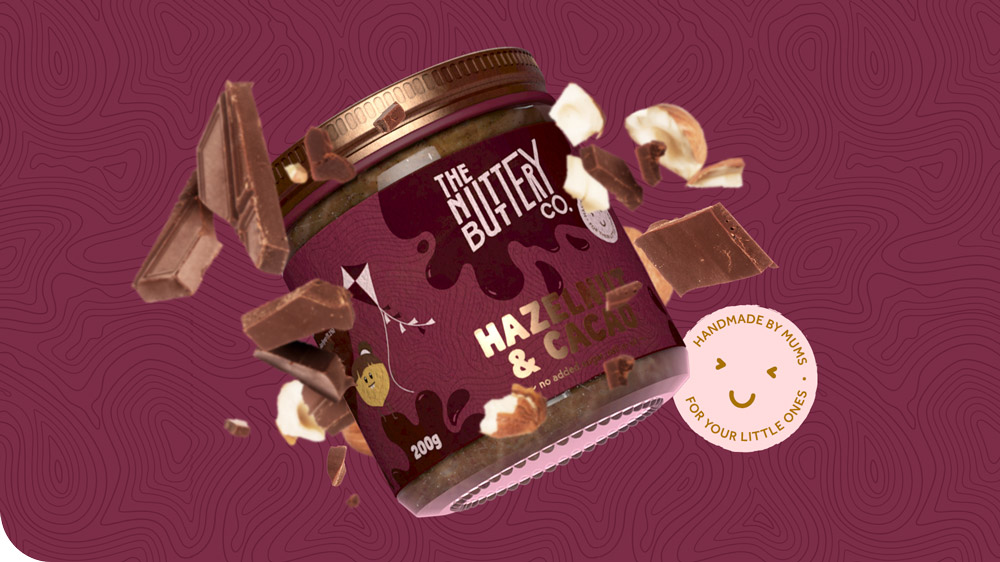
Details: The Nuttery Buttery Company make a range of nut butters primarily aimed at children. There were many repeating letters in the brand name, so I wanted to create a logo that made a feature of this. For example, the ‘U’ extended over both lines whilst also feeling like it has been spread, a nice link back to the product. The hand drawn feel indicated the handmade nature of the product while feeling playful and energetic.
Year: 2020
Full Project: The Nuttery Buttery Co.
Details: Founded on a passion for wellness and sustainability, Harmos design and sell aromatherapy based products. They wanted the logo to communicate luxury, due to their positioning within the market, which was achieved by the selection of premium typefaces.
Year: 2020
Details: SMY digital solutions are an IT company, powering productivity and profit through technology, enabling customer’s businesses to thrive. I based their logo around less and more than symbols. These have significance in the world of digital code.
The above animation showcases how the logo was formed from the < / >, using the ‘y’ as the framework to build these distinguishing elements around.
Year: 2019
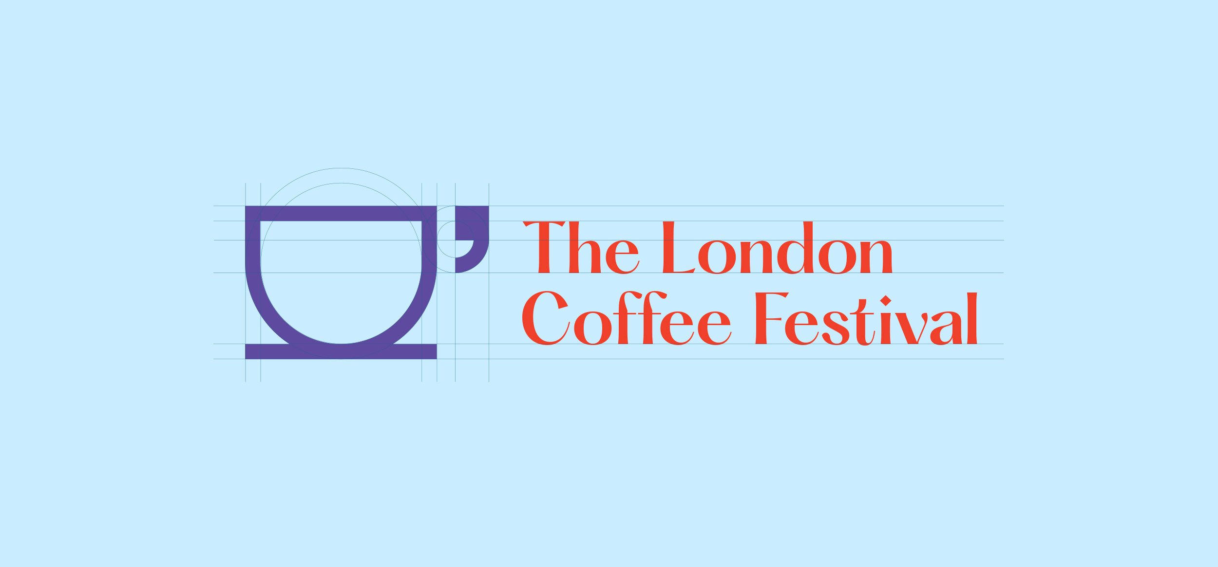
Details: The 2022 installment of The London Coffee Festival was the first in three years due to the Cornavirus pandemic and various lockdowns. I therefore wanted this years logo to be a celebration of people coming together again, sharing thoughts and opinions around the world of coffee. This was brought to life by the speech mark making up the cups handle.
Year: 2022
Full Project: The London Coffee Festival
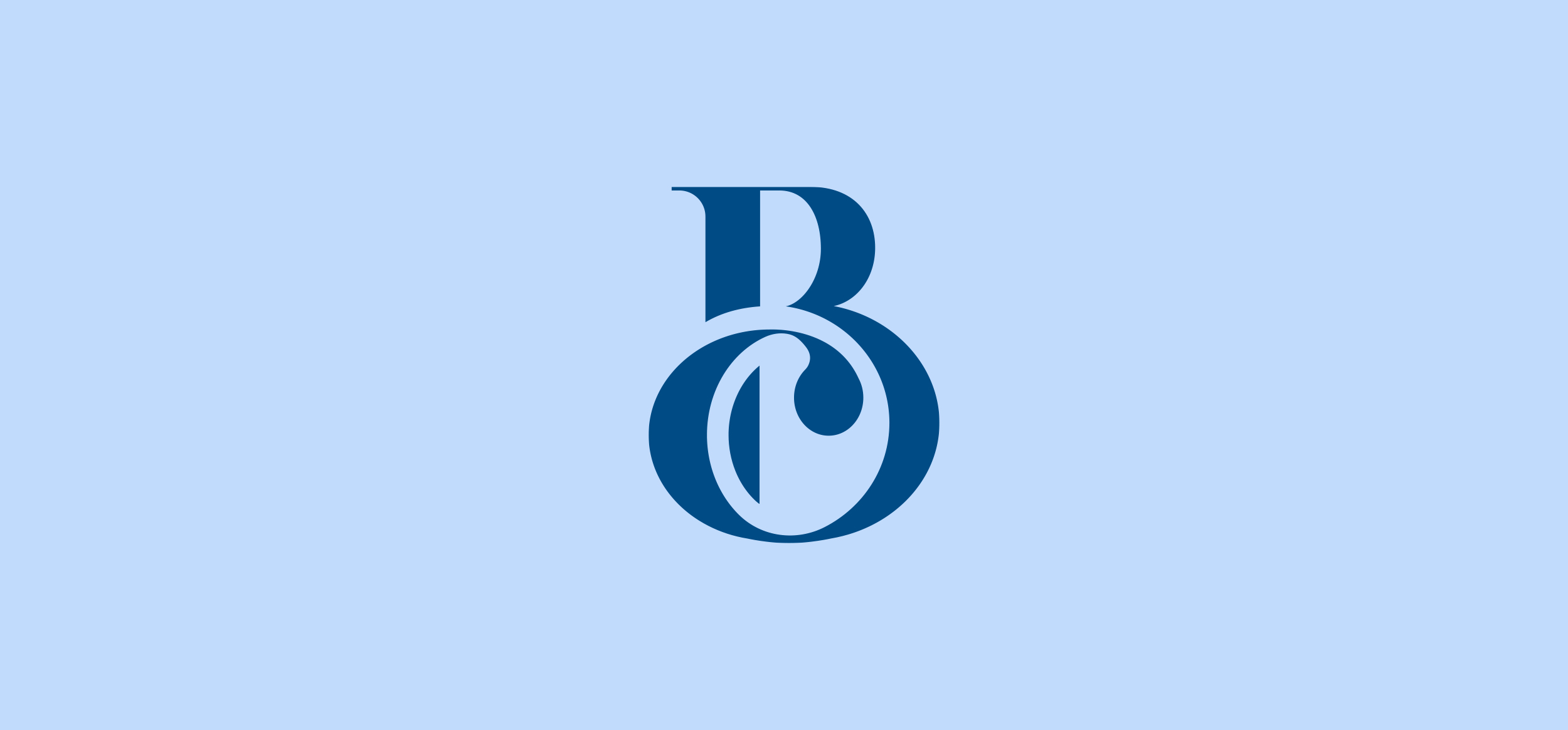
Details: Burlington Primary Care are a doctors surgery based in Suffolk. I wanted my identity refresh to retain a traditional and classical feel — basing the BPC monogram on a serif typeface gave the mark an air of heritage and establishment. It conjures up feelings of deep rooted experience, giving the surgery a trustworthy feel.
Year: 2019
Details: I was part of the team designing, developing and leading Equals Money through a rebrand. This included creating a responsive logo, that would flex depending on the touchpoint and space it was being used in.
Year: 2020
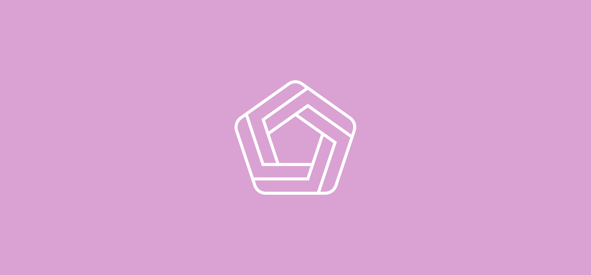
Details: Social Acumen is a social media advertising agency designed to take startups through data-driven advertising. I designed their logo around their 5-step process which was a core pillar of their business. The formation of lines create an impossible shape that has no ending. This was a lovely way of visualising their ongoing relationship with clients.
Year: 2017
Client: Various
Category: Brand Identity | Typography
Involvement: Art Direction | Design
Software: Illustrator | After Effects
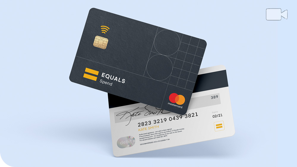
Equals Money
I was brought into my first in-house role to help develop and implement their rebrand as a creative lead.
