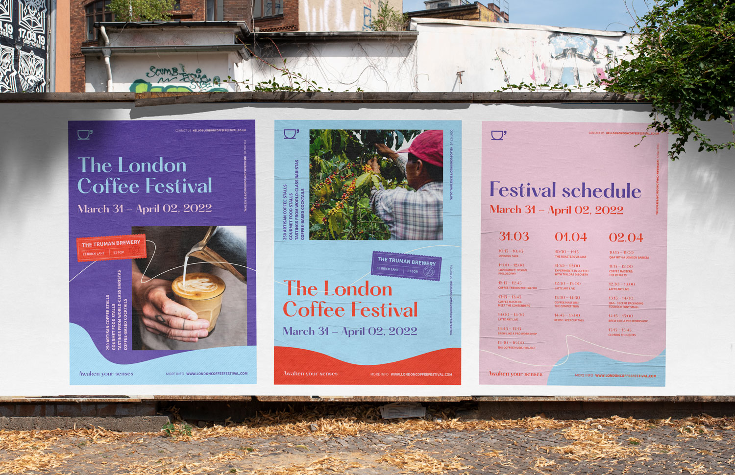
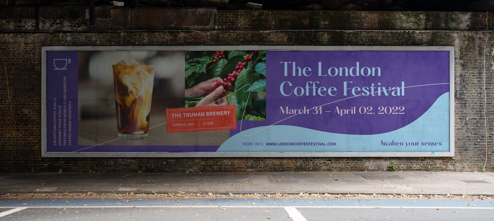
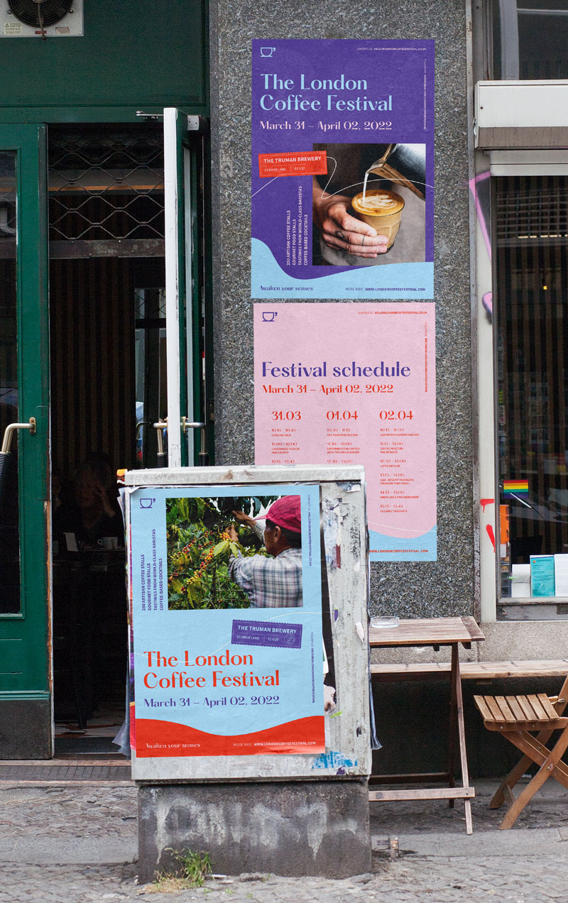
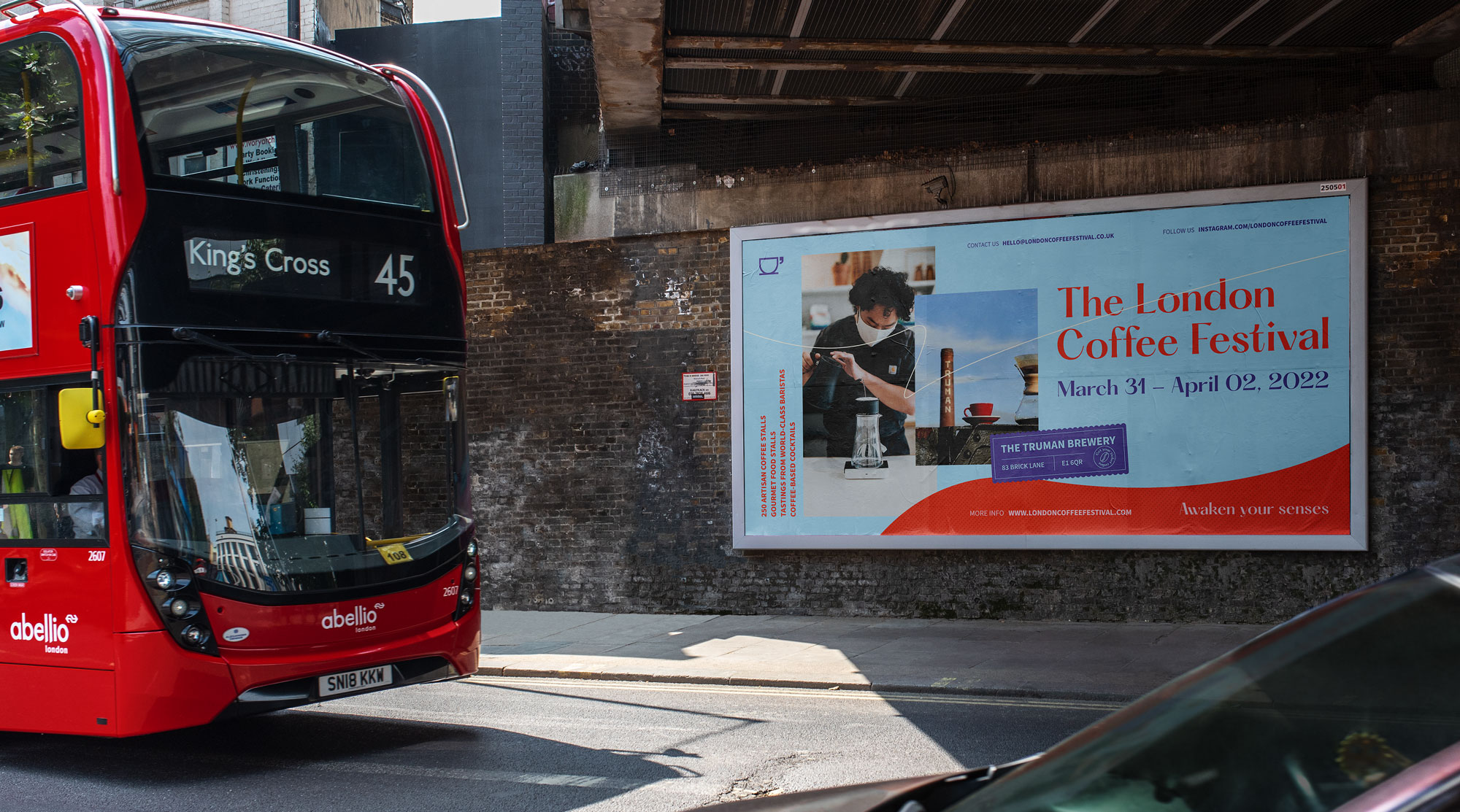
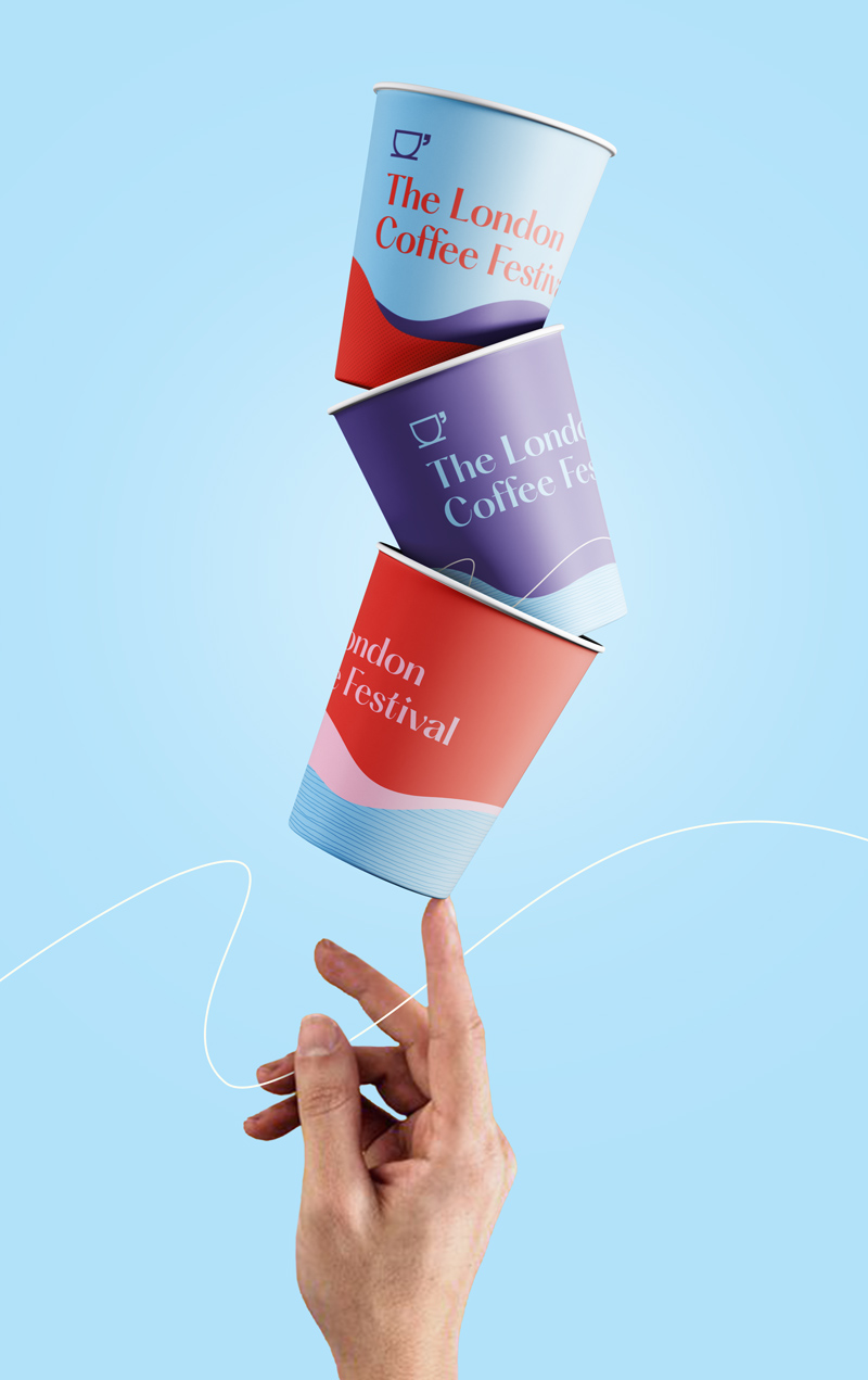
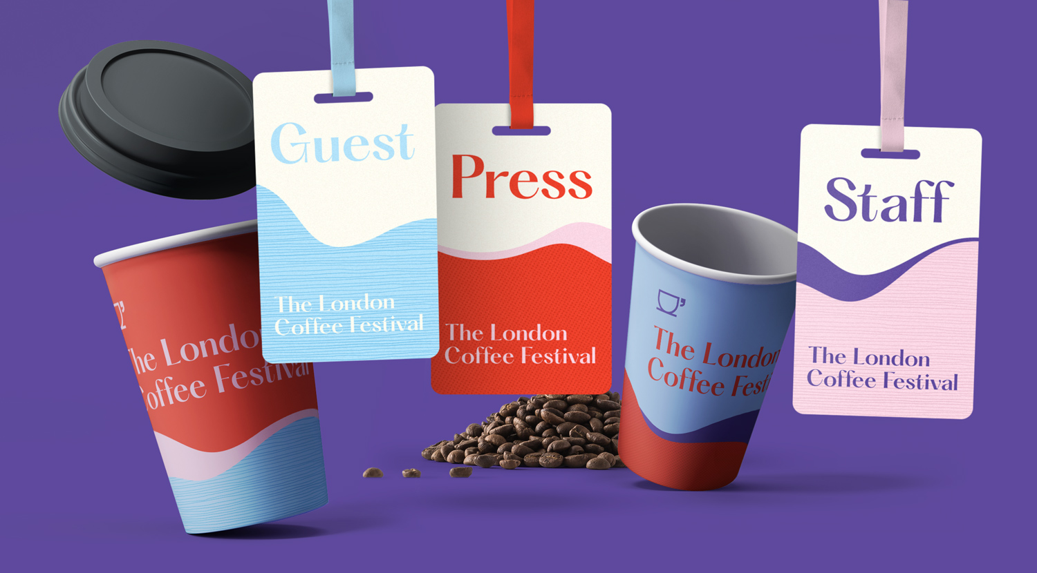
With so many different brands present at the festival, the overarching event identity had to be bold, recognisable, and provide a consistent red thread throughout.
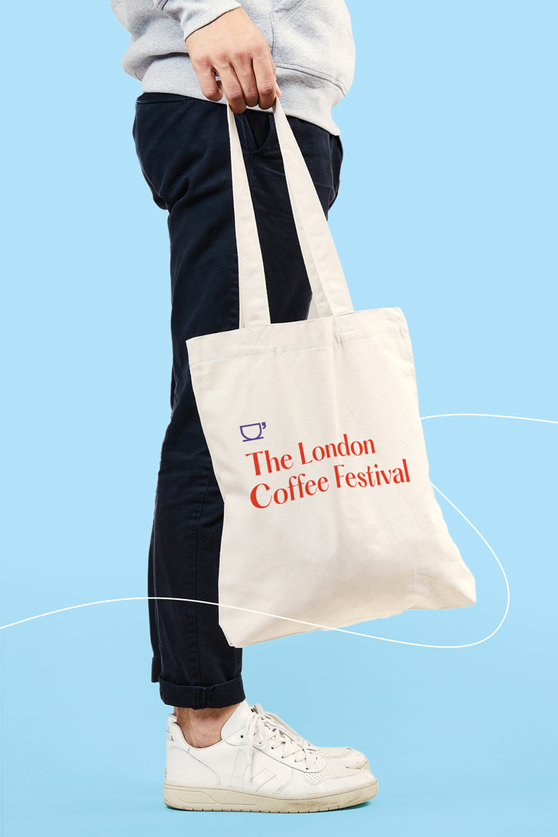
The adaptable but striking design system was easy to implement and flexed across out of home communication to promote the event, their website to sell tickets, and event assets themselves.
Previous years of the London Coffee Festival identity had been apologetic, inconsistent and forgettable. After two years of postponements, 2023 needed to do things differently.


In the lead up to this years event, attendees had dealt with a complete stop to social events after numerous lockdowns due to the Coronavirus pandemic.
With this in mind, I wanted the logo to evoke people being brought together and sparking conversation - cleverly using a speech mark as the cup's handle.
The colour palette was upbeat and eye-catching, sure to catch the eye when used across advertising. I developed a suite of colours that would compliment the contrasting darker tones of coffee.


The colour palette was a unique take on a category that historically played it safe with the same blacks, whites and muted tones. Our take was fresh, new and breathed life into an event, that in previous years, had simply merged into the background at it’s very own festival – visually overpowered by the brands it hosted.


Client: The London Coffee Festival [concept only]
Category: Event | Identity
Involvement: Art Direction | Design | Rollout
Agency: Personal Freelance • Year: 2022
Market Region: UK
Software: Photoshop | Illustrator